Creating a Fun
& Informative Environment
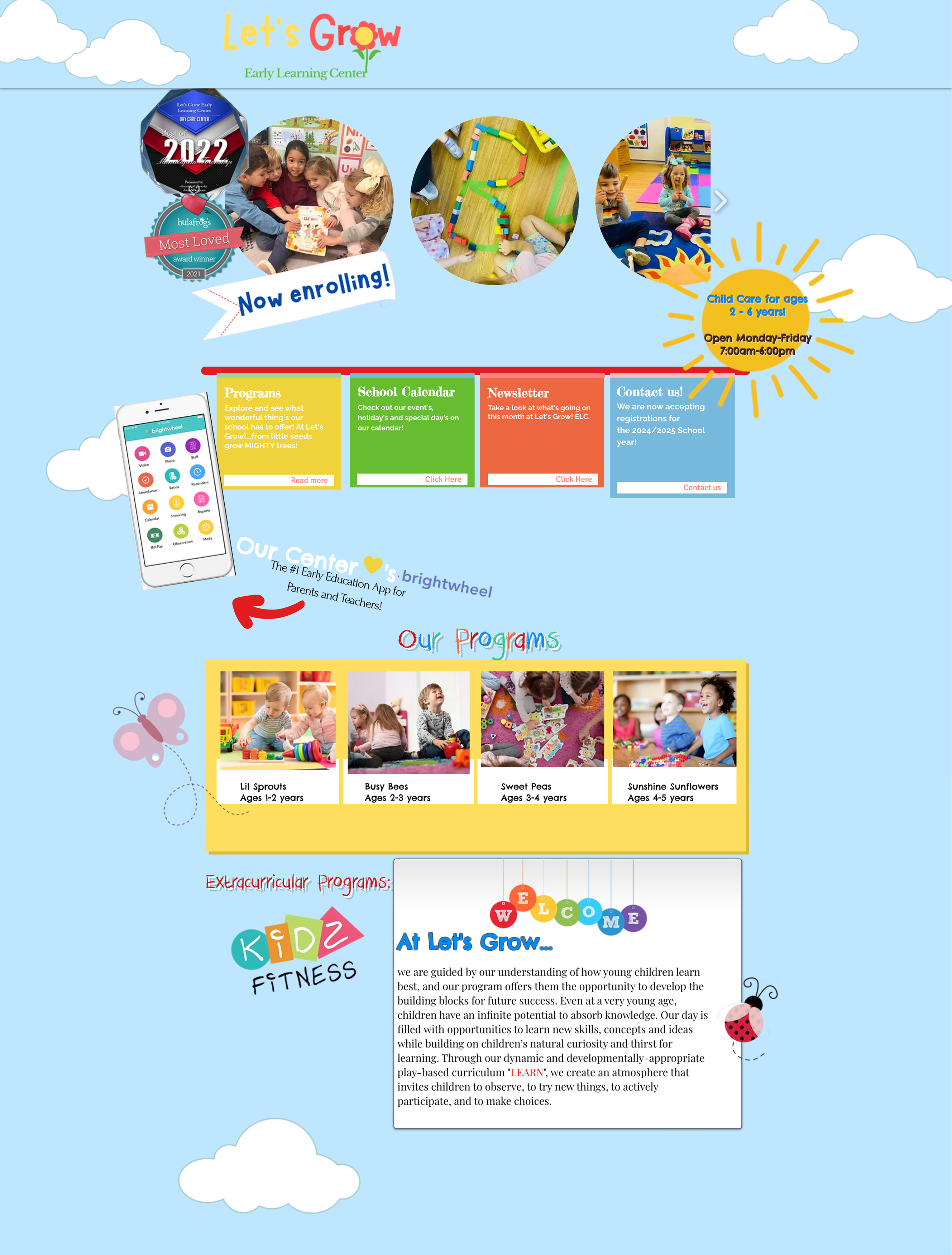
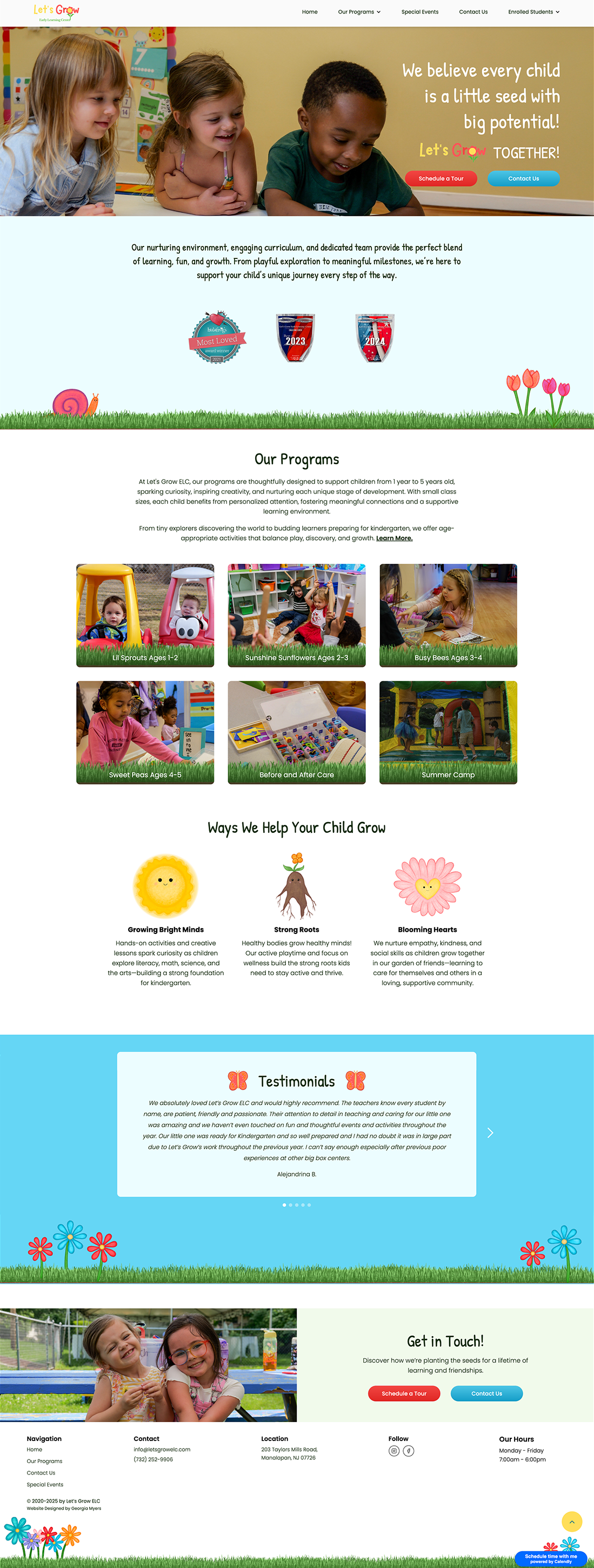
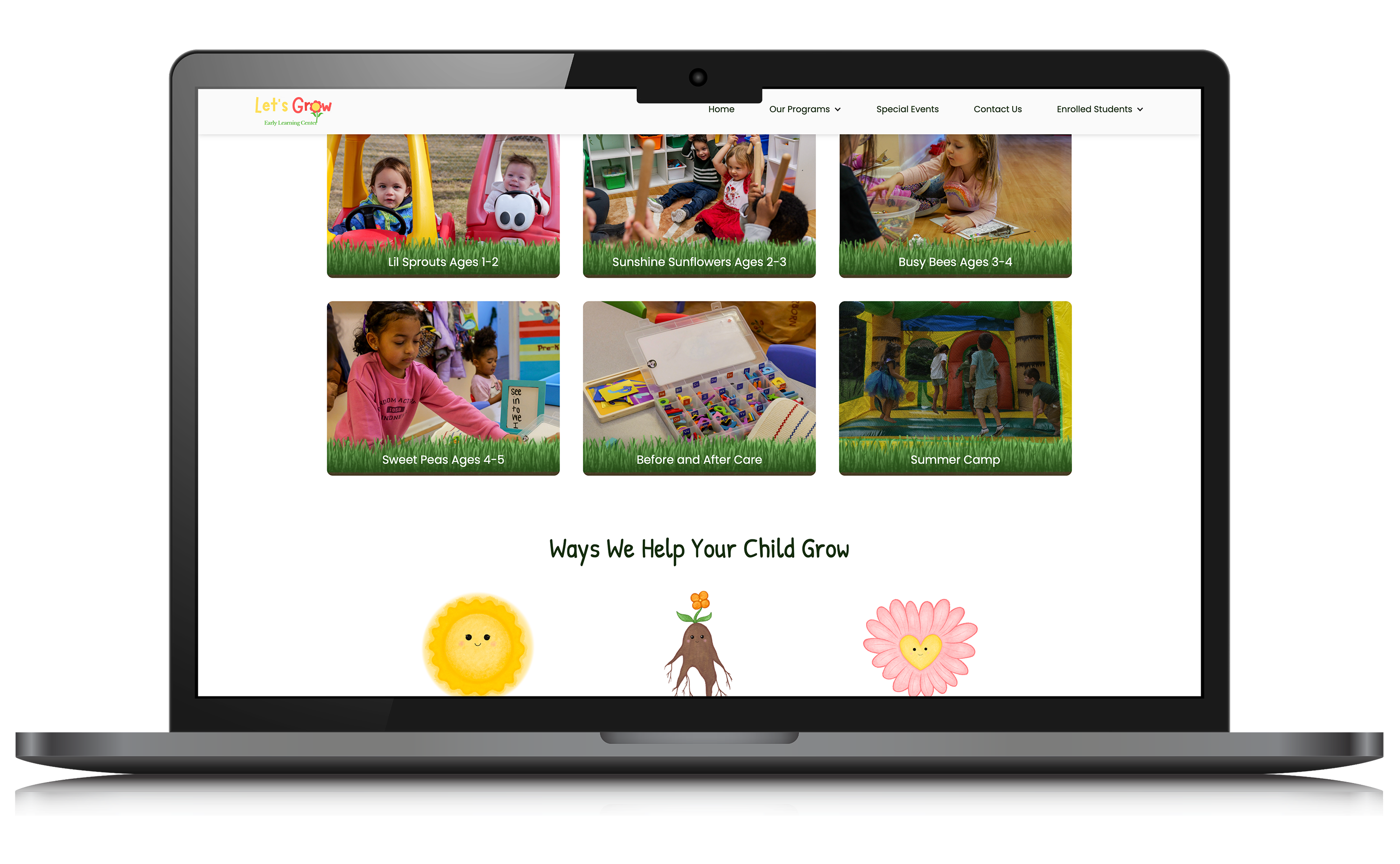
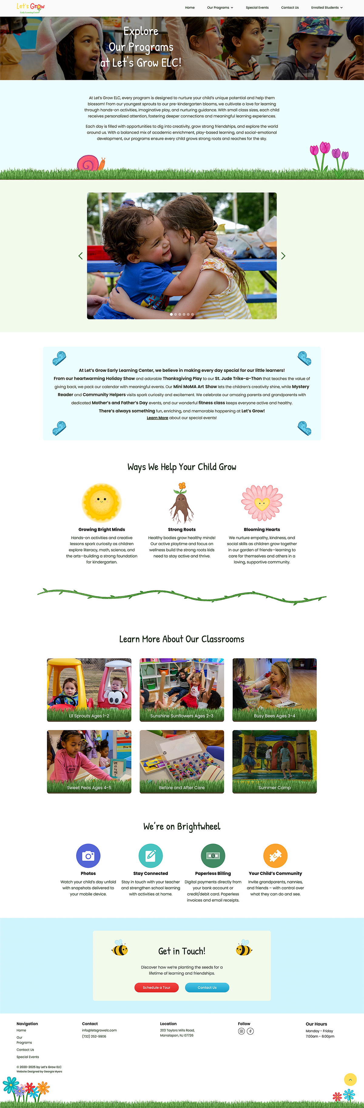
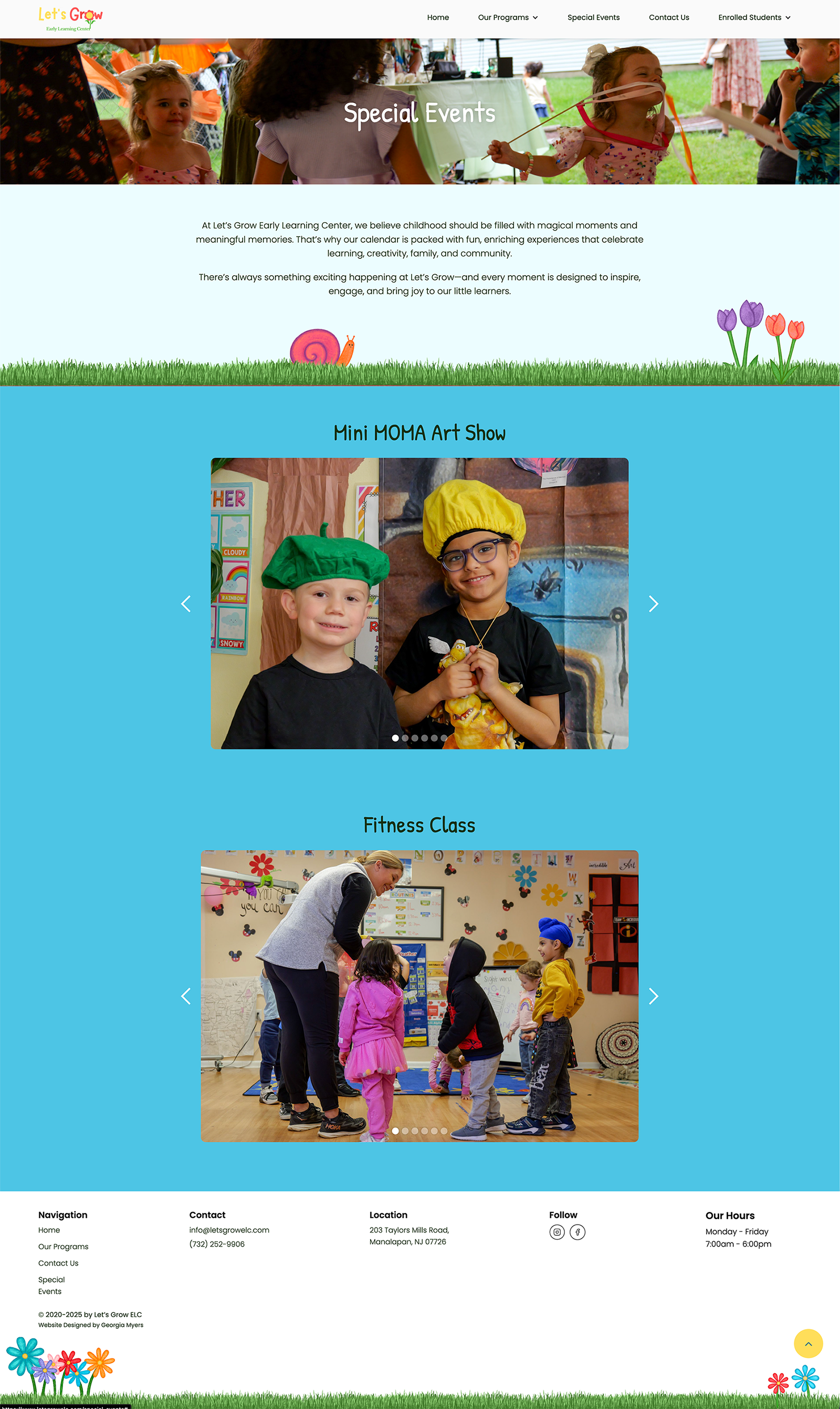
When designing the site, the main goal was to give parents enough information to understand the preschool and feel confident enrolling their child. Therefore, it was important to balance professionalism with a sense of fun. Small illustrations add visual interest and help anchor the text. This helps to create a consistent template for informational sections, making the content is easier to digest. Vibrant, engaging photography brings the preschool to life and gives a glimpse into the environment.